Forge
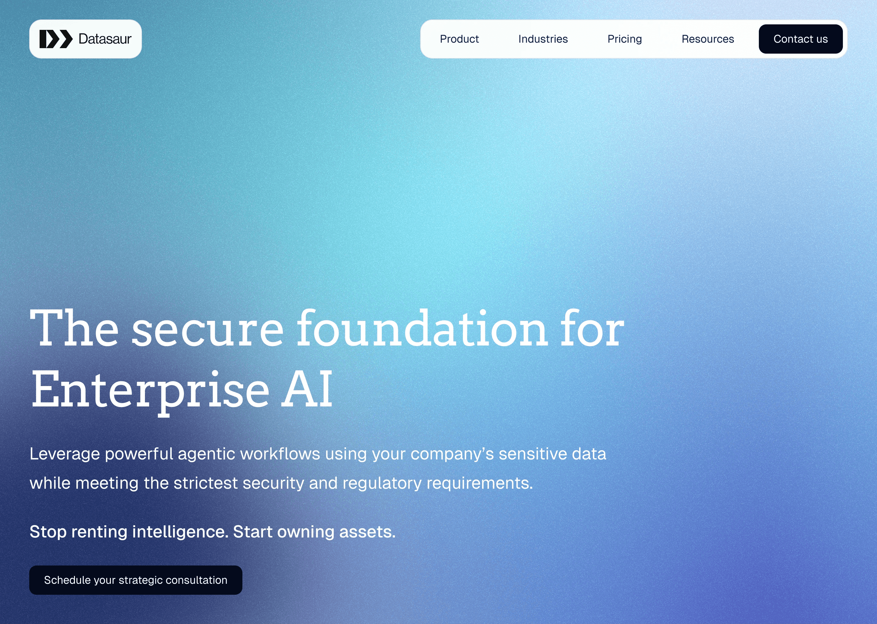
A new design system and website for Datasaur's expansion into AI consulting.
Company
Timeline
How I helped
Led the website redesign to align with the new brand and visual guidelines
Managed the website rollout, reviewing engineering updates and giving final approval for publication
Maintain the website and its design system, ensuring consistency and alignment with brand standards
View work
+50%
website visitors
+8%
engagement rate
~30
pages affected
01
Overview
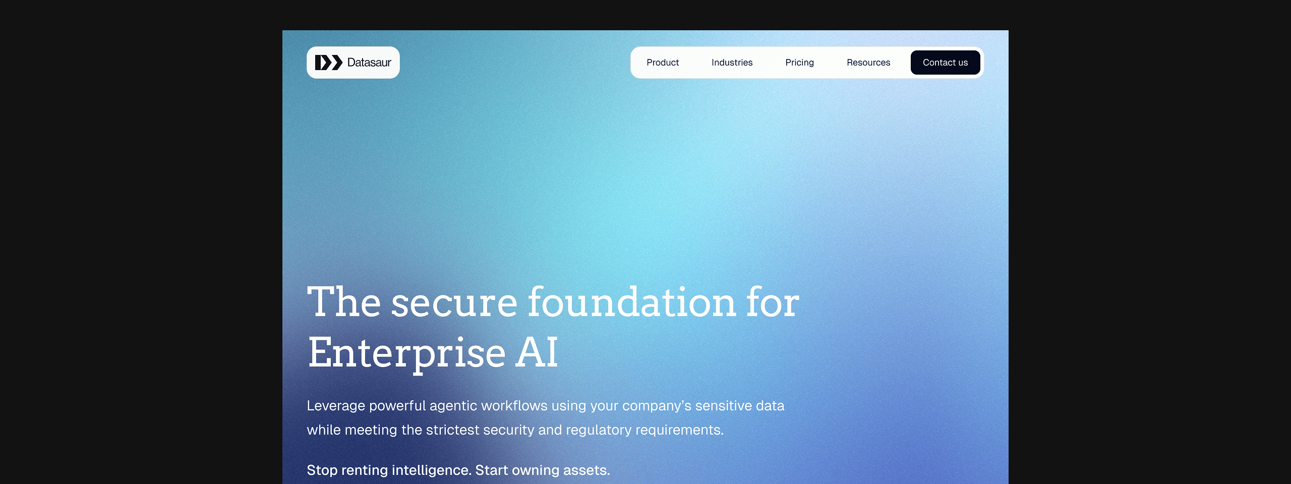
In late 2025, after a few pilot AI consulting projects went well, Datasaur's leadership officially announced a new direction: expanding beyond data labeling and HITL into AI consulting. As more of these consulting projects came in, it was clear the company needed a website that actually reflected this new direction — and that landed on my desk.
Challenges
Tight timeline
Building a new design system and designing every page across the site — homepage, product, pricing, industries, and the full Resources suite — in roughly 4 weeks left little room for delays.
Copy in flux
Website copy was handled by a third-party writer and wasn't finalized even after design work began, with some changes landing as late as final production — requiring the design to stay flexible enough to absorb late content changes without breaking layout or hierarchy.
Parallel system-building
Since the new design system was being built at the same time as the pages themselves, early pages sometimes needed rework as the system evolved underneath them.
02
Process
Research & direction
Before designing, I put together a moodboard of comparable AI/consulting sites — Palantir, McKinsey, Cohere, IntegratedBio, and others — organized by section (hero, social proof, benefits, verticals, products, testimonials, footer) to understand current patterns across the space. From this, I distilled a set of key highlights to guide the new direction:
Hero section: Full-screen image or video
Typography: Thin sans-serif, limited use of bold text
Images: Grainy texture for a softer, more retro feel — applied to both live-action images and 3D shapes
Icons: Thin, outlined icons for a cleaner look that doesn't overwhelm the page
Accent: Thin dividers between sections for a cleaner look, especially when limiting the number of cards shown
This research directly shaped the typography and palette options I brought to leadership for approval.


Establishing the system
Since the moodboard's key highlights were still fairly abstract, I applied them to a few real homepage options — different combinations of typography and color — so leadership could evaluate the direction concretely rather than react to references alone. I gave my own recommendation alongside the options, and once a direction was approved, I built out the core components — buttons, typography styles, cards, and the rest of the component library — with the library continuing to grow as I moved into designing additional pages.
Handling copy in flux
Rather than waiting on finalized copy before starting, I designed against the first draft as-is, even though it hadn't been checked against our sentence-case convention yet. Once the copy reached roughly 95% final, I went back and updated it to match — treating the initial draft as something to design around, not a blocker to progress.
03
Result
Since launch, the new site has been used by leadership to represent the company's new direction externally — including in a presentation to the board — reflecting its role as more than just a visual refresh, but a credible public face for the business's expanded direction.